:format(webp))
Essential Agile Metrics and How to Master Them
By the end of this article, you’ll understand the most widely used Agile metrics, their strengths and pitfalls—and discover advanced measures that top teams use to keep improving and deliver real value.
Core Agile Metrics
Metric | Description | Uses | Warnings |
|---|---|---|---|
Velocity | Amount of work completed per sprint (often in story points) | Sprint planning, forecasting team capacity | Misleading if teams change estimation method |
Sprint Burndown | Chart showing work left to do in a sprint over time | Tracking progress within a sprint | Can be gamed or misrepresent work if tasks not updated daily |
Cumulative Flow Diagram (CFD) | Visualizes the state of work items over time across process stages | Identifying bottlenecks, workflow optimization | Hard to interpret if workflow changes are frequent |
Lead Time vs Cycle Time | Lead: time from request to delivery; Cycle: time work item is in process | Measures efficiency, highlights delays | Misunderstood definitions cause confusion |
Throughput | Number of work items completed in a given time period | Teams’ output rate, trend analysis | Variability may hide systemic issues |
Work Item Age | Time elapsed on items in progress | Detects stagnating tasks | Needs context on what ‘too old’ means |
Defect Density | Number of defects per unit of work (e.g., per story or KLOC) | Quality measurement | Different code bases and standards skew comparisons |
Control Chart | Plots work item completion times over time | Reveals variability, trends, process stability | Outliers may be misinterpreted without context |
Velocity
Velocity tracks the amount of work (usually in story points) your team completes each sprint, as explained in Atlassian’s guide on agile software development velocity .
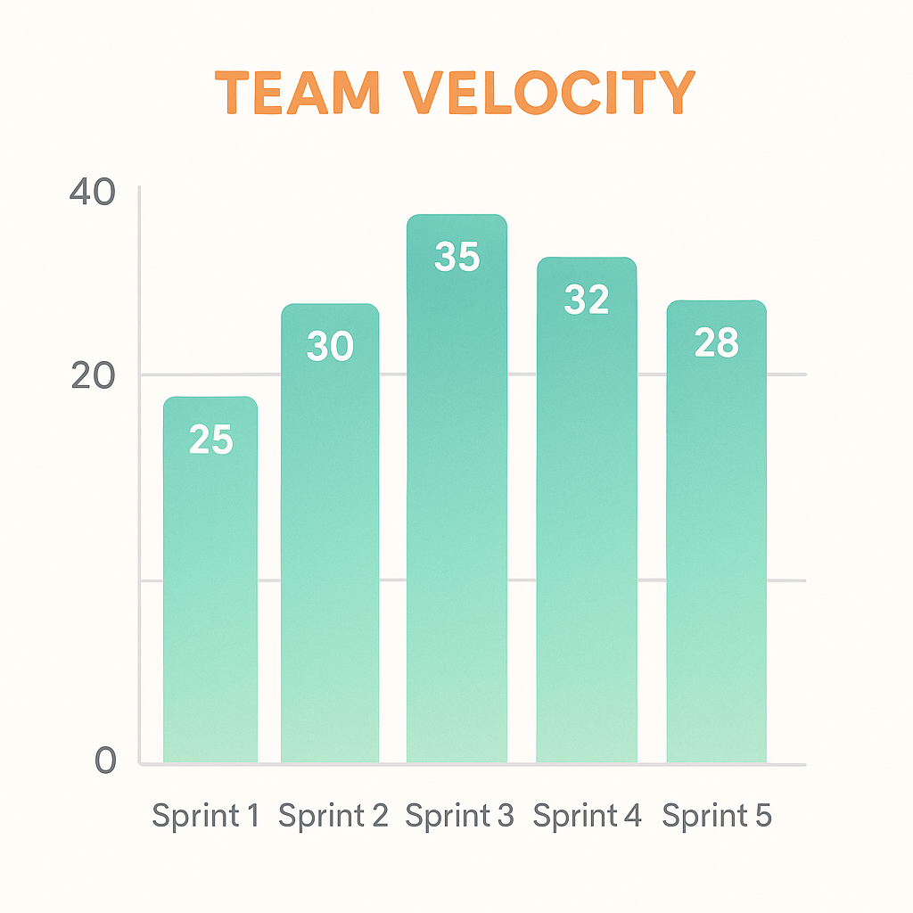
Uses: Helps forecast how much backlog you can tackle in future sprints.
Warnings: Don’t compare velocities across teams or inflate story points to look “faster.”
Sprint Burndown
A Sprint Burndown chart shows remaining work over time, signaling scope creep or stalled tasks early, as outlined in Scrum.org’s definition of burndown charts .
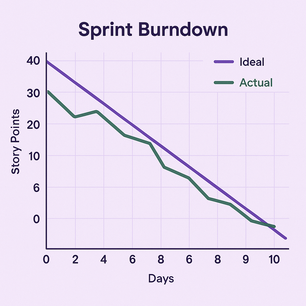
Uses: Signals scope creep or stalled tasks early.
Warnings: Only reliable if your team updates task statuses diligently.
Cumulative Flow Diagram (CFD)
A CFD displays how many work items are in each state (e.g., To Do, In Progress, Done), revealing bottlenecks and helping limit work in progress, as detailed in Kanbanize’s article on cumulative flow diagrams .
Uses: Reveals bottlenecks and helps limit work in progress.
Warnings: Requires a consistent workflow; otherwise categories can shift mid-chart.
Lead Time vs. Cycle Time
Lead Time: Time from a request entering the backlog until it’s delivered.
Cycle Time: Time from work start to completion.
Both metrics are defined in Mike Cohn’s breakdown of the best agile metrics on Mountain Goat Software .
Uses: Measures responsiveness and efficiency of your process.
Warnings: Definitions must be crystal-clear or data will be misleading.
Throughput
Throughput counts how many work items you finish in a given period, tracking delivery rate and exposing long-term trends, according to the Agile Alliance’s overview of agile metrics .
Uses: Tracks delivery rate and exposes long-term trends.
Warnings: Doesn’t account for item size—finishing ten small tasks isn’t the same as one large feature.
Work Item Age
Work Item Age measures how long an in-progress item has been open, flagging tasks that linger longer than expected, per BMC’s agile metrics overview .
Uses: Flags tasks that linger longer than expected.
Warnings: Resetting or splitting tasks can hide true age.
Defect Density
Defect Density, calculated as the number of defects detected divided by the size of the codebase or feature, gauges product quality and highlights modules needing attention, as explained by Visual Paradigm’s guide to agile metrics .
Uses: Gauges product quality and highlights modules needing attention.
Warnings: Smaller features often yield artificially low defect counts.
Control Chart
A Control Chart plots cycle times to show variation and outliers, helping you spot process instability, according to GitLab’s post on agile metrics and control charts .
Uses: Helps you spot process instability.
Warnings: Outliers can skew the averages—focus on trends, not single points.
Advanced Metrics for Next-Level Insight
DORA Metrics
Google’s DevOps Research and Assessment team introduced four metrics that link engineering practices with business outcomes in their State of DevOps Report :
Deployment Frequency
Lead Time for Changes
Change Failure Rate
Mean Time to Recovery
Metric | Definition |
|---|---|
Deployment Frequency | How often code is successfully deployed to production. |
Lead Time for Changes | The amount of time it takes for a commit to get into production. |
Change Failure Rate | The percentage of deployments causing a failure in production. |
Mean Time to Recovery | The average time it takes to restore service when a failure occurs in production. |
Uses: Offers a clear view of DevOps health and delivery performance.
Warnings: Focused on delivery pipelines—complement, don’t replace, other Agile metrics.
Psychological Safety
Psychological safety is a team’s shared belief that it’s safe to take risks without punishment, as described in Amy C. Edmondson’s Harvard Business Review article on building psychological safety .
Uses: Teams with high psychological safety report better innovation and fewer bottlenecks when raising issues.
Warnings: Survey fatigue and anonymity worries can skew results.
Psychological safety describes a shared belief that the team is safe for interpersonal risk taking.
— Amy C. Edmondson
Customer Satisfaction (NPS)
Net Promoter Score asks: “How likely are you to recommend our product on a scale of 0–10?” Companies with high NPS grow revenue at more than twice the rate of their competitors, according to Bain & Company’s report on the Net Promoter System .
Uses: Tracks whether delivered features resonate with users.
Warnings: It’s just one number—always collect qualitative feedback too.
Technical Debt Accumulation
Technical debt can be quantified by tracking overdue refactoring tasks or measuring code smells and anti-patterns over time, as explained in Cprime’s guide to technical debt .
Uses: Forecasts when velocity might slow and when quality sprints are due.
Warnings: Estimating debt is subjective—define clear criteria for what counts.
Flow Efficiency
Flow Efficiency, calculated as (Active Time ÷ Total Elapsed Time) × 100%, quantifies how much time work sits idle versus being actively handled, as defined in LeanKit’s Kanban guide .
Uses: Quantifies how much time work sits idle versus being actively handled.
Warnings: Requires precise timestamps for each workflow transition.
Putting Metrics into Action
Select only a handful of metrics that align with your goals.
Automate data collection to minimize overhead.
Share results openly—focus on improvement, not blame.
Review and adjust which metrics you track at regular intervals.
Your Continuous Improvement Playbook
Armed with these measures—both classic and cutting-edge—you can spot bottlenecks, gauge quality, and keep your team learning. The real power of metrics isn’t in the charts you generate, but in the conversations and changes they inspire. Keep iterating on what you measure, and you’ll keep delivering more value sprint after sprint.
:format(webp))
:format(webp))
:format(webp))