:format(webp))
:format(webp))
React Component Libraries and Emerging Trends in 2025
By the end of this article, you’ll know which React UI libraries power today’s apps and what fresh approaches are reshaping component design—everything from “copy-paste” architectures to headless primitives, performance tips, accessibility benchmarks, CSS integrations, and more.
Top React Component Libraries in 2025
Here’s where most teams start when building interfaces, according to the State of JS 2024 survey :
Material UI (MUI)
Ant Design
Chakra UI
React Bootstrap
Semantic UI React
Fluent UI
Blueprint UI
Evergreen UI
Atlaskit
Grommet
Rebass
PrimeReact
Reactstrap
Carbon Components
Top React Component Libraries in 2025
Library Name |
|---|
Material UI (MUI) |
Ant Design |
Chakra UI |
React Bootstrap |
Semantic UI React |
Fluent UI |
Blueprint UI |
Evergreen UI |
Atlaskit |
Grommet |
Rebass |
PrimeReact |
Reactstrap |
Carbon Components |
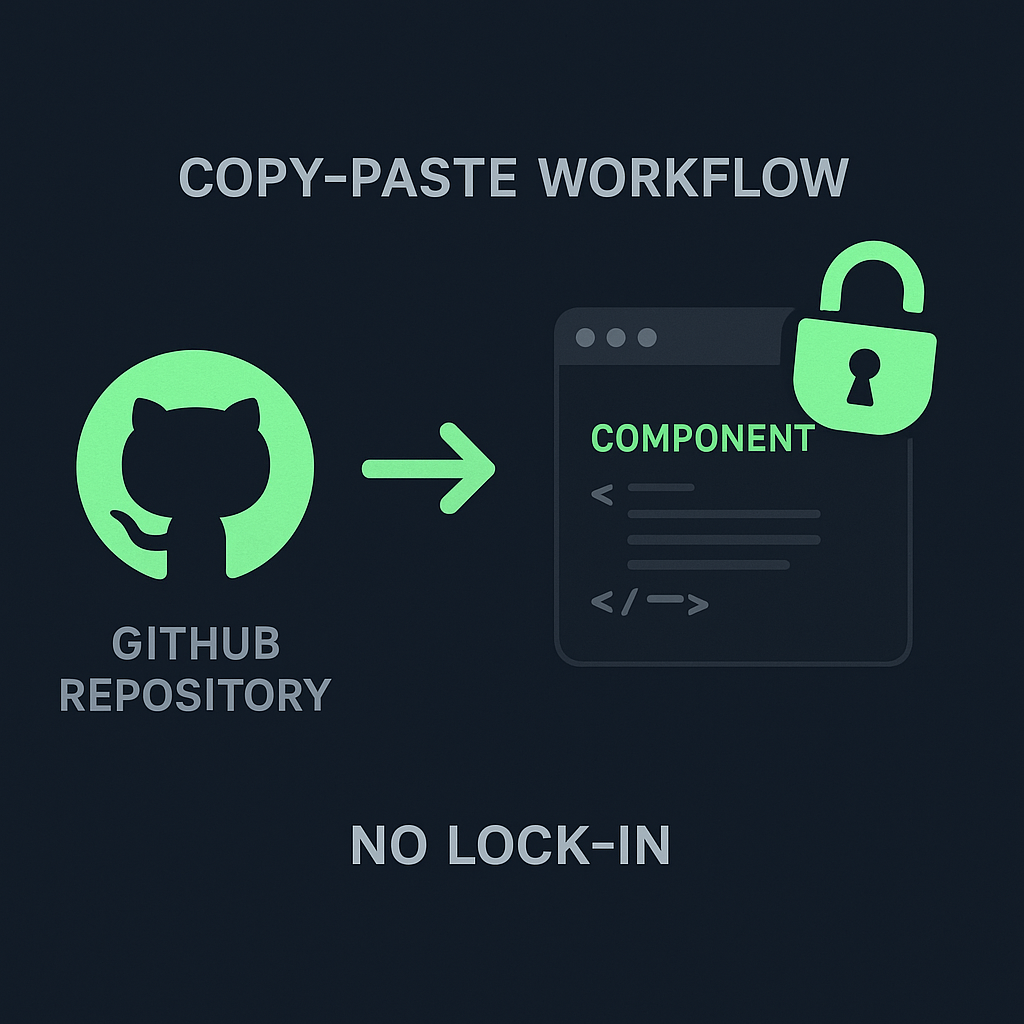
Copy-Paste Architecture: shadcn/ui
Unlike typical packages, shadcn/ui encourages you to copy component source code directly into your repo by pulling from the official GitHub repository . That gives you full control over styling, removes hidden dependencies, and prevents “lock-in” when you want to modify internal logic or remove unused bits entirely.
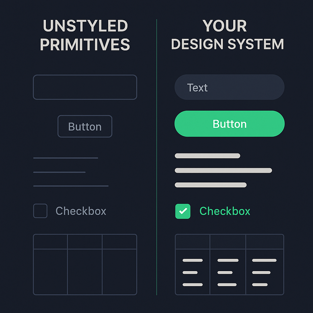
Headless Components: Radix UI
Radix UI offers unstyled, accessible primitives—menus, dialogs, tooltips—handling all ARIA attributes and keyboard interactions so you can apply your own theme or design system. This separation of logic from style sets it apart from opinionated kits, as explained in the Radix UI documentation .
Advanced Hooks and Form Management: Mantine
Mantine stands out with a library of hooks—`useForm`, `useNotifications`, `useFocusTrap`—and built-in support for nested field arrays, async validation, and context-aware error handling. These features simplify complex forms without pulling in a separate library, as detailed in the Mantine theming guide .
Performance and Bundle Size
In 2025, load time matters. Libraries like NextUI and Radix UI are optimized for minimal footprint, full tree-shaking, and SSR friendliness. NextUI’s docs highlight sub-40 KB gzipped components and near-instant hydration in most frameworks—see the NextUI performance guide .
Performance and Bundle Size
Library | Gzipped Size (KB) | SSR Friendly |
|---|---|---|
NextUI | 38 | Yes |
Radix UI | 30 | Yes |
Accessibility and Compliance
Some libraries lead in WAI-ARIA compliance and focus on keyboard navigation, screen-reader announcements, and focus management:
Chakra UI has built-in roles and focus styles for every component, as outlined in the Chakra UI accessibility documentation .
Radix UI primitives come with full ARIA support out of the box, aligning with the WAI-ARIA Authoring Practices .
Integration with Utility-First CSS
Bridging the gap between component kits and utility frameworks, DaisyUI and Tailwind UI let you mix prebuilt components with Tailwind classes so you can prototype rapidly without abandoning utility-first workflows:
DaisyUI provides a set of Tailwind CSS components with utility classes .
Tailwind UI offers premium React components and templates from Tailwind Labs’ official collection .
Internationalization and RTL Support
Global apps need solid i18n and right-to-left layouts:
Ant Design offers a unified API for locale switching and RTL flipping in its i18n guide .
MUI provides robust RTL support and built-in locale providers for dozens of languages, as shown in the MUI RTL guide .
Community-Driven vs. Corporate-Backed
Your choice affects roadmap and support:
Ant Design, backed by Alibaba, often aligns with enterprise needs and maintains a formal release cycle.
MUI enjoys corporate sponsorship from financial and tech firms while maintaining open-source governance.
Community-led projects like shadcn/ui or Mantine often move faster on niche features but may rely on volunteer maintainers.
React Server Components Compatibility
With React Server Components gaining ground, some libraries adapt to server-driven rendering and streaming. The official React Server Components documentation outlines patterns for mixing server and client components seamlessly.
Animation and Motion
Static components only go so far. Framer Motion pairs well with any UI library to add spring physics, layout transitions, and keyframe animations that respond to state changes, as described in the Framer Motion documentation .
The Road Ahead for React UI
Today’s ecosystem offers both proven frameworks and up-and-coming approaches that grant you more control, better performance, and stronger accessibility. As React evolves—with server components, new CSS paradigms, and tighter integration points—your choice of UI library will shape how you build, maintain, and scale interactive experiences.
:format(webp))
:format(webp))
:format(webp))