:format(webp))
:format(webp))
Mastering Tailwind CSS in React: From Setup to Advanced Performance
By the end of this article, you’ll know how to install and configure Tailwind CSS in a React project, apply utility classes effectively, and leverage advanced techniques—like JIT compilation, smart purging, server components, dynamic theming, and benchmarks—to keep your app lean and fast.
Installing and Configuring Tailwind CSS in React
Getting Tailwind up and running in a React project involves just a few steps.
Create a React app (if you haven’t already):
npx create-react-app my-app

cd my-app
Install Tailwind and its PostCSS plugins:
npm install -D tailwindcss postcss autoprefixer

npx tailwindcss init -p
This generates `tailwind.config.js` and `postcss.config.js`, following the Tailwind CSS installation guide .
Configure your `tailwind.config.js`:
module.exports = {
  content: ["./src/*/.{js,jsx,ts,tsx}"],
  theme: { extend: {} },
  plugins: [],
};
Add the Tailwind directives to `src/index.css`:
@tailwind base;
@tailwind components;
@tailwind utilities;
Now you can use Tailwind’s utility classes directly in your JSX.
Styling React Components with Utility Classes
Tailwind encourages you to apply utility classes in your JSX, but you can also extract and conditionally apply them.
Direct Usage and Extraction
function Button({ children }) {
  return (
    <button className="px-4 py-2 bg-blue-600 text-white rounded">
      {children}
    </button>
  );
}
To reuse or conditionally apply classes:
import clsx from "clsx";


function Alert({ children, type }) {
  const base = "p-4 rounded";
  const color = type === "error"
    ? "bg-red-500 text-white"
    : "bg-green-500 text-black";
  return <div className={clsx(base, color)}>{children}</div>;
}
Here, we combine utility classes with the clsx package on npm to manage conditional styling cleanly.
Custom Components and Themes
You can encapsulate commonly used patterns:
export const Card = ({ children }) => (

  <div className="shadow-md p-6 bg-white dark:bg-gray-800 rounded-lg">
    {children}
  </div>
);
And extend your theme in `talwind.config.js`
theme: {

  extend: {

    colors: { brand: "#1E40AF" },

    spacing: { '72': '18rem' }

  }

}
Integrating CSS-in-JS and Styled Components
If you use a CSS-in-JS library, you can mix Tailwind utilities:
import styled from "styled-components";
const StyledButton = styled.button.attrs({
  className: "px-5 py-2 bg-brand text-white rounded-lg"
})``;
This approach is consistent with the Styled Components documentation , letting you combine Tailwind’s utility-first workflow with scoped styles.
Advanced Performance Techniques
When your app grows, you’ll want to optimize build times and bundle size.
JIT Compilation and Hot Reload
Tailwind v3’s Just-In-Time engine generates only the classes you use, on-demand. This often leads to:
Faster initial builds
Near-instant hot module reload
Zero need for manual purging
According to the release notes for Tailwind CSS v3.0 , JIT is enabled by default and supports arbitrary values out of the box.

Smart Purging for Component Libraries & Micro-Frontends
By default, Tailwind removes unused styles based on your `content` paths. For shared libraries or micro-frontends:
Use glob patterns to include external packages:
content: [
  "./src/*/.{js,jsx}",
  "../shared-components/*/.{js,jsx}"
]
Whitelist dynamic classes (e.g., `"bg-${color}-500"`) with `safelist`.
Consider splitting CSS per micro-frontend to avoid shipping unnecessary utilities.
Using Tailwind CSS with React Server Components & Next.js
Next.js App Router and React Server Components (RSC) let you deliver styles more efficiently:
Server components can render static HTML with embedded CSS, reducing client-side JavaScript.
Tailwind’s JIT works seamlessly in Next.js when you include your app’s folder in `content`.
Hydration only ships the utilities actually used by that component.
Feature | Benefit |
|---|---|
Server components can render static HTML with embedded CSS | Reduces client-side JavaScript for faster load and execution |
Tailwind’s JIT works seamlessly in Next.js when you include your app’s folder in `content` | Ensures efficient, on-demand CSS generation improving performance |
Hydration only ships the utilities actually used by that component | Minimizes shipped code, decreasing bundle size and improving load times |
For full details, refer to the Next.js App Router and RSC guide .
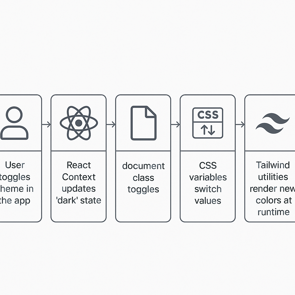
Dynamic Theming via CSS Variables and React Context
CSS variables make runtime theming straightforward:
In your CSS:
:root {

  --color-bg: #ffffff;

  --color-text: #111827;

}

.dark {

  --color-bg: #1f2937;

  --color-text: #f9fafb;

}
In React:
const ThemeContext = React.createContext();

function ThemeProvider({ children }) {
  const [dark, setDark] = useState(false);

  useEffect(() => {
    document.documentElement.classList.toggle("dark", dark);
  }, [dark]);

  return (
    <ThemeContext.Provider value={{ dark, setDark }}>
      {children}
    </ThemeContext.Provider>
  );
}
Use your variables in Tailwind’s config:
theme: {
  extend: {
    colors: {
      background: "var(--color-bg)",
      text: "var(--color-text)"
    }
  }
}
This approach is detailed in the CSS-Tricks guide to CSS custom properties .
Memory Usage and Performance Benchmarks
At scale—think thousands of components—Tailwind’s overhead remains minimal:
Since JIT only generates needed utilities, your CSS bundle rarely grows beyond a few hundred KB.
Community benchmarks show large React apps (5,000+ components) using Tailwind have similar memory profiles to pure CSS approaches.
Frequent profiling (via Chrome DevTools or React Profiler) helps catch regressions early.
For general guidelines on optimizing React performance, see React’s performance optimization guide .
Bringing It All Together
You’ve walked through everything from initial setup to advanced optimization:
Installing and configuring your toolchain
Structuring and reusing utility classes
Embracing JIT, purging, and micro-frontend patterns
Pairing Tailwind with Next.js Server Components
Implementing dynamic theming with CSS variables
Profiling memory and performance at scale
With these strategies, your React projects will stay responsive, maintainable, and lean—no matter how large they grow.
:format(webp))
:format(webp))
:format(webp))